Choosing Floral Silk Satin Fabric is not just a matter of liking a print. The right choice depends on fiber content, weave, weight, finish, and intended use. Silk satin is valued for its smooth face and fluid drape, but those qualities vary between fabrics. A bright floral pattern may look crisp online, then appear softer or more muted in daylight. Small details matter.
William Morris, the British textile designer and artist, offered a useful design principle: “Have nothing in your houses that you do not know to be useful, or believe to be beautiful.” His words are not a fabric specification, but they fit this decision well. A fabric should suit its purpose and appeal to the eye. For a dress, check how the satin moves and whether its weight supports the silhouette. For a scarf or lining, consider how the surface feels against skin. Inspect the reverse, too. It can reveal print clarity and finishing.
A screen cannot replace a swatch. Hold one near a window, bend it gently, and check whether the floral colors shift under different light. Ask the supplier about silk content, fabric weight, care instructions, and return terms. If possible, test a small piece before ordering yardage. Even a careful inspection has limits; a sample may not represent every part of a production batch. That is worth remembering. This guide explains how to compare these details and choose Floral Silk Satin Fabric with fewer surprises.
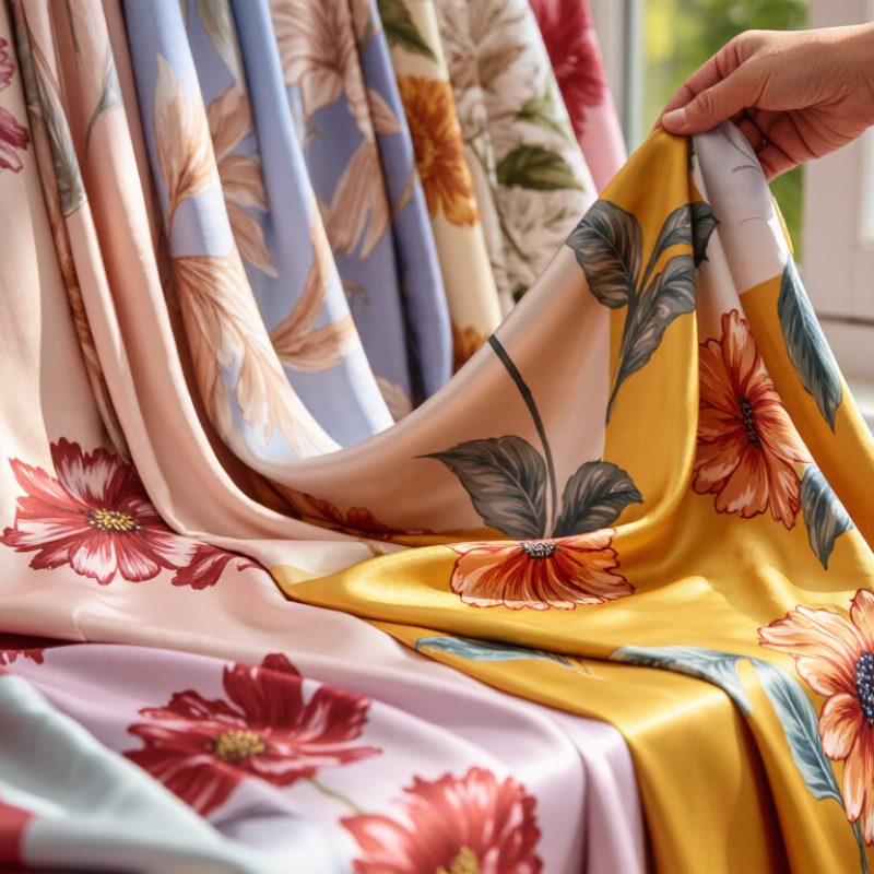
Floral silk satin is silk fabric woven in a satin structure and decorated with a floral design. Satin describes the weave, not a separate fiber. In many satin weaves, warp threads pass over several weft threads, creating long floats on the face. These floats reflect light and feel smooth, while the reverse is usually less glossy. Handle it gently. Long floats can snag.
Production starts with silk filaments reeled from cocoons and spun or twisted into yarn. The yarn may be degummed to remove sericin, a natural coating that makes raw silk feel firmer. It is then dyed or prepared for weaving. Floral designs can be printed onto finished cloth or woven in with a jacquard setup. Printed motifs may feel flat; woven motifs can add texture. Processes vary between producers.
When examining a sample, look at both sides and tilt it near a window. Notice whether the flower edges stay clear and whether the fabric drapes without feeling brittle. A very glossy surface can be appealing, but it may hide uneven printing under shop lights. One swatch is not the whole story. Ask how the pattern was applied and check care guidance, since finishes and dyes can affect how silk responds to washing.
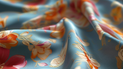
To verify silk content, start with the product specification and request documentation that identifies the fiber composition, not just “silky” or “silk-touch.” Shine can mislead. Polyester satin may look glossy, while silk can have a softer, shifting glow. Check a cut edge with a magnifier: silk fibers often appear fine and irregular, but visual inspection cannot confirm fiber content. For higher confidence, ask an independent textile laboratory to test a sample.
Avoid treating a burn test as definitive. It can be hazardous, and blends or finishes may affect the result. A small swatch is more useful for practical checks: note its weight, drape, and feel in daylight, then compare these with the seller’s description. Keep in mind that finishing treatments can make silk feel crisp or unusually smooth. That detail is easy to overlook.
Satin describes a weave, not a fiber. Examine both sides: the face should have a smooth surface, while the reverse usually looks less lustrous. Long surface floats create satin’s shine, but they can snag. Gently move the fabric under a lamp and look for uneven gloss, pulled threads, or thin patches. For floral prints, inspect petals and outlines closely; blurred edges may signal weak print definition, though they do not prove poor silk. A larger sample gives a fairer impression.
When comparing floral satin, inspect a physical swatch whenever possible. Screens can shift both color and contrast. View the fabric beside a window, then under warm indoor light. Satin reflects light, so a cream background may look brighter at one angle and duller at another. Check whether the flower colors stay distinct across these settings. I still get this wrong sometimes.
Pattern scale changes how a print feels when worn. A large bloom may look dramatic on a full skirt but lose its shape on a narrow sleeve. Small florals can appear delicate from a distance, yet busy up close. Ask for the print repeat, or measure the distance between matching flowers on the swatch. Then compare that spacing with the garment’s panels. A motif cut at a seam can look accidental.
Look at the fabric from several feet away, not only close up. This shows whether the flowers blend into a soft field or form clear shapes. For a flowing dress, check that the print remains pleasing where the satin gathers and folds. If possible, drape the swatch over your arm and move it. The result may surprise you. A color that looked perfect flat can feel too strong in motion. When two options seem close, compare them side by side in the same light rather than relying on memory.
| Comparison point | Small-scale floral | Medium-scale floral | Large-scale floral | What to check |
|---|---|---|---|---|
| Typical motif size | Usually under about 2 in (5 cm) across | About 2–6 in (5–15 cm) across | Often over about 6 in (15 cm) across | These are practical visual categories, not fixed industry standards. Check the actual motif dimensions and repeat on the fabric. |
| Overall impression | Fine, detailed, and visually even | Balanced and clearly floral without dominating the surface | Bold and statement-making | View the print from both close up and at the distance the finished garment or project will usually be seen. |
| Best suited to | Shirtings, scarves, narrow panels, and projects where a subtle print is preferred | Blouses, dresses, skirts, and many accessories | Full skirts, wide panels, statement garments, and larger accessories | Consider the garment’s seam placement and pattern pieces; large motifs may be cut off or split at seams. |
| Color contrast | Low contrast can make small details blend together; higher contrast makes them easier to distinguish | Moderate contrast often keeps both the flowers and background visible | Strong contrast emphasizes the main motifs; low contrast gives a softer effect | Compare the lightness of the background and motifs, not only their hue. Check that important details remain visible at a distance. |
| Color palette | A limited palette can keep a dense print from looking busy | Related hues create a coordinated look; an accent color adds definition | A restrained background and a few clear accent colors can help large motifs read well | Check that the colors work with intended linings, trims, and other garments in natural and indoor light. |
| Effect of satin sheen | Fine details may appear softer as reflected light shifts across the surface | The sheen can make color transitions look more noticeable as the fabric moves | Reflective highlights can draw attention to large motifs and folds | Silk satin reflects light directionally, so a flat photograph may not show its appearance in motion. Inspect a physical swatch if possible. |
| Pattern repeat and layout | A short repeat can create a continuous, closely spaced effect | A balanced repeat can show distinct motifs without leaving large gaps | A larger repeat may need more fabric to place motifs intentionally | Ask for the vertical and horizontal repeat measurements, and check whether the design is directional or has a one-way layout. |
| Print placement and cutting | Small motifs are generally easier to distribute across smaller pattern pieces | Check motif alignment across fronts, backs, and sleeves | Plan motif placement at center fronts, hems, and prominent panels | Allow extra yardage when matching a repeat or positioning a specific motif is important. |
| Final selection tip | Choose the scale and palette that suit the project, then compare the print on a swatch at full size. | Confirm fiber content, fabric width, care instructions, and color consistency with the seller before ordering. | ||
Note: Motif-scale ranges above are general comparison guidelines. Actual appearance varies with print repeat, viewing distance, lighting, and fabric finish.
Satin describes a weave, not a fiber, so check the composition before comparing floral fabrics. For silk satin, compare momme weight and ask for the fabric’s weight in grams per square metre when available. A 16-momme silk is about 69 g/m². Lighter cloth can suit blouses and scarves; a heavier option often feels more substantial in skirts or dresses. Small details matter. Weight alone does not predict drape: weave density, lining, and garment cut also affect how fabric falls.
Hold a swatch against a window, then let it hang from your hand. A fluid drape softens large floral motifs, while a firmer body can keep them crisp. Check the reverse, too; loose threads or uneven print edges may show more on glossy satin. Textile Exchange’s Materials Market Report 2024 estimates that polyester accounted for 57% of global fiber production in 2023. That figure does not measure silk quality, but it is a reason to verify fiber content rather than rely on the word “satin.” Compare finishes under indoor and natural light: a high sheen can make printed colors look brighter, sometimes too bright. I would still request a sample before ordering, since screen colors and small swatches can mislead.
Care instructions can change the real cost of floral silk satin. Check the fiber content, finish, and care label before comparing prices. “Satin” describes a weave, not a fiber, so silk satin and polyester satin may need different cleaning. Textile Exchange’s Materials Market Report 2024 estimates global fiber production reached 124 million tonnes in 2023, with polyester making up about 57%. That scale makes fiber identification especially important: a glossy surface alone tells you little.
Look for clear guidance on washing, drying, ironing, and stain removal. If the label says dry-clean only, factor in those recurring costs. For washable fabric, ask whether the seller has tested dimensional change; AATCC Test Method 150 provides a standard procedure for measuring fabric shrinkage after home laundering. A swatch test helps, too. Dab a hidden corner with water, then check for color transfer, puckering, or a dulled sheen. Don’t assume a small sample predicts every result.
Compare value per usable garment, not just price per meter. A heavier satin may drape beautifully, but it can feel warm and require more careful pressing. Check the reverse side, print alignment, and seam behavior under gentle handling. Floral motifs can make matching seams waste extra fabric. That cost is easy to miss. I would still allow room for uncertainty: care labels and test swatches cannot fully predict wear after repeated use.